Reports
Reports shows how every location is doing, in five views, for any period you choose. Everything from Google is computed at the moment you open it, never from an archive, so the numbers are what Google holds right now.
Each view is a set of cards, and every card is built the same way: a title and what it measures, the headline figure in large type with a short descriptor, a line saying whether that is better or worse than the comparison period (▲ green for better, ▼ red for worse), and then the chart itself, with its axis, gridlines and a legend. Hover any bar, point or slice for its numbers in words.
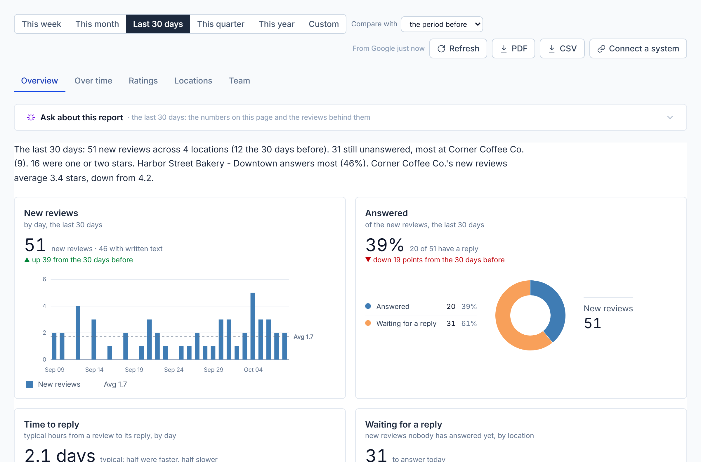
The Overview with the sample businesses, for the last 30 days compared with the 30 days before.
Choosing a period, and what to compare with
Across the top: This week (from Monday), This month, Last 30 days, This quarter, This year, or Custom with two dates (up to two years).
Compare with sets what "better or worse" means:
- the period before: the same length of time just before the period (the 30 days before the last 30 days).
- before StellaQuin: the same length of time ending the day Google was connected, so you can see what has changed since you started answering reviews here.
Refresh asks Google again. PDF downloads the whole report, all five views, as a PDF file laid out for paper (the cards exactly as you see them, each view on its own pages). CSV downloads the Overview table as a spreadsheet. Connect a system (admins) leads to Settings, where Power BI, Domo or a spreadsheet can pull these numbers on a schedule (see Connected systems).
Location managers see their own locations only, in every view.
Overview
The report opens with a plain sentence written from the numbers, for example: "The last 30 days: 53 new reviews across 4 locations (41 the 30 days before). 34 still unanswered, most at Lakeview (10). 12 were one or two stars. Northside answers most (46%). Downtown's new reviews average 3.9 stars, down from 4.4." It's the report in one breath; everything below it is the detail.
Beneath it, the cards for all your locations together:
| Card | What it shows |
|---|---|
| New reviews | The total for the period (and how many have written text), with a bar for each day, week or month and a dashed Avg line. |
| Answered | The share of new reviews with a reply (100% means every review got an answer), as a donut of answered against waiting, with the counts beside it. |
| Time to reply | The typical time from a review to its reply (half were faster, half slower; in hours, or days beyond two days), with a bar per day, week or month and the period's typical value as a dashed line. |
| Waiting for a reply | New reviews nobody has answered yet, one bar per location, each with an answer them link that opens the inbox on that location. |
| Stars given | Every new review by the stars it gave, as a donut with a legend table (count and share for 5 stars down to 1), and the average stars with its change. |
| New reviews by location | Grouped bars: this period beside the comparison period, for each location. |
| Google rating by location | The average of every review each location has ever had, as Google shows it today, on a 0 to 5 bar. |
Then the table of every location, the one that most needs attention first: most reviews waiting, then the lowest average of new stars, then the lowest rating. Order by switches to most waiting, lowest rating, most new reviews, lowest answered, or slowest to reply. Hover any column heading for what it means.
| Column | Meaning |
|---|---|
| Location | Name, and its total reviews on Google. |
| Google rating | The average of every review the location has ever had, as Google shows it today. |
| New reviews | Written in the period, with the comparison period beneath it. |
| Answered | Of the new reviews, the share with a reply, and the change. |
| Time to reply | Typical time from a review to its reply, as above. |
| Waiting | New reviews still without a reply, with an answer them link. |
| Average stars of new | The average stars of this period's new reviews, and whether it rose or fell. |
Over time
Four cards, per day (periods up to a month), per week (up to six months) or per month (longer), for all locations or one chosen from the menu:
- New reviews: a bar for each day, week or month, with Max, Avg and Min lines labeled at the right edge.
- Average stars: a line of the average stars of each period's new reviews, on a 0 to 5 axis, with the whole period's average as a dashed line. Rising reviews with falling stars is the pattern to catch early.
- Answered: a line of the share of each period's reviews that has a reply, against an orange Goal 100% line.
- Time to reply: a bar per period of the typical hours from a review to its reply, with the average as a dashed line. Lower is better.
Ratings
Reviews grouped the way customer-satisfaction scores group them: customers who gave 5 stars are promoters, 4 stars passives, and 1 to 3 stars detractors. The score is promoters minus detractors as a share of all reviews, from −100 to 100; above 50 is excellent, below 0 means more unhappy customers than delighted ones.
The Score card shows the score, what it means in words, how it compares with the comparison period, and a donut of promoters (green), passives (yellow) and detractors (red-orange) with the counts and shares beside it. Score by location shows each location's split as one bar with the counts inside and the score at the end, best first. Stars given by location does the same for all five star levels, with the average at the end. Detractors over time charts the one- to three-star reviews per day, week or month as bars, with the promoter share as a green line on the right-hand axis.
Locations
The leaderboard. Google rating, ranked puts every location in order on a 0 to 5 bar. Answered by location shows each location's new reviews as answered (blue) and waiting (orange), with the share at the end. New reviews by location compares this period with the comparison period as grouped bars. Time to reply by location ranks the locations fastest first. The table beneath has every figure: review total, new reviews (and before), average stars of new with the change, answered, and time to reply. The line above names the leader.
Team
Who answered reviews in the period, from StellaQuin's own record of each reply (which is kept for as long as you like, so this works for any period). Replies by person is one bar per person, most first; Time to reply by person ranks them fastest first, with each person's fastest and slowest beneath their name. The table beneath has the figures:
| Column | Meaning |
|---|---|
| Replies | Replies this person posted. |
| Approved for others | Teammates' replies this person approved (see Approvals). |
| Typical time to reply | From the review to their reply: half faster, half slower. |
| Fastest / Slowest | Their quickest and their longest. |
| Locations | Where they replied. |
Only replies posted from StellaQuin are attributed to a person; a reply made directly on Google can't be.
Downloading
PDF downloads the whole report for the chosen period as one file: the Overview, Over time, Ratings, Locations and Team views, each starting on its own page, drawn exactly as they appear on screen. CSV downloads the Overview table, including the comparison period's figures, as a spreadsheet file.
To feed these numbers to another system on a schedule (Power BI, Domo, a shared spreadsheet), see Connected systems.
Report emails
For the people who read reports rather than the inbox, an admin can schedule a report email at the bottom of the page:
- How often: Off, Daily, Weekly, Monthly or Quarterly.
- Format: how the report arrives.
- The report as a PDF, attached: the whole report, every view, drawn as you see it on screen, attached as a PDF. The email itself carries a one-paragraph summary and the per-location table.
- Pictures in the email, plus the PDF: the Overview appears as a picture right in the email, so the reader sees the cards without opening anything; the full PDF is attached as well.
- A spreadsheet (CSV), with a table: the numbers per location as a table in the email and as a CSV file attached, for people who want to work with the figures.
- On: the weekday (weekly) or the day of the month, 1 to 28 (monthly and quarterly; quarterly goes out in January, April, July and October).
- Around: the hour it goes out.
- To: the recipients' email addresses, separated by commas. Up to 20. They don't need StellaQuin accounts.
Press Send a test email first: it sends the report right now, in the format chosen and to the addresses in To (or to your own address when To is empty), without saving anything, so you can see in your inbox exactly what the recipients will get. (With Off selected it covers the last 30 days; otherwise the last complete day, week, month or quarter.) Then press Save; the note beneath confirms when it goes out.
A daily report covers yesterday; weekly the previous Monday-to-Sunday week; monthly the previous calendar month; quarterly the previous quarter. The email itself is short, one line saying which report it is ("Here is your weekly reviews report for Harbor Street Bakery, the week of…"), the picture if that format was chosen, and the attachment; the breakdown is in the report, not repeated in the email. If the report can't be drawn one time, the spreadsheet goes out instead with a line saying so. The Activity log notes each sending.
Report emails are part of every paid plan.
Ask about this report
When your organization has connected the AI advisor, a card called Ask about this report sits above the views. Open it to talk about the report on the screen: the numbers for the period you chose, compared as you chose, and the reviews behind them, with customers' names, phone numbers and email addresses withheld before anything is sent.
| What you get | |
|---|---|
| Summarize this report | What the numbers say, what you're doing well, and what needs attention first. |
| What are we doing well? | The strengths, by location, with what customers said. |
| What do customers like? | The things praised most often, and how often each comes up. |
| What don't they like? | The complaints that keep coming up, how often, and where. |
| Where are the gaps? | Unanswered reviews, slow replies, locations behind the others, drops against the period before: what to fix first. |
| About | Choose a location to make every question about that location alone; "the whole business" is the default. |
| Ask | Anything else, in your words: "Why did the average drop?", "Which location should I visit this week?", "Compare Downtown and Northside." Follow-ups continue the conversation. |
Changing the period or the comparison starts a fresh conversation about the new report. The advisor sees what the report sees: every review written in the period counts in the numbers, and the reviews' words travel with them (for a very long period, the oldest may be left out of the words, and the advisor is told how many).